Introduction
I’m currently a Data Science major at UC San Diego and was lucky enough to get an internship at GSI Technology for the summer. This is my first blog, and in it I’ll be giving some background on satellite imagery and walking through the process I went through of acquiring image data from Capella Space — an information services company providing Earth observation data on demand — and doing some basic exploration of it. I was excited to receive this assignment from my mentor because I’ve been curious about satellite data from reading about its current and potential applications in environmental conservation. This is a very easy way to get started with exploring it if you, too, are interested.
Earth Observational (EO) Data
You may be surprised by the great extent to which EO data can impact our day-to-day lives. Here are a few interesting examples:
- Satellite data is used to count cars in the parking lots of major retailers such as Walmart, providing investment funds with predictors of corporate profits to help investors choose stocks.
- In precision agriculture, satellite imagery is used to detect moisture and vegetation levels of crops, among other metrics, informing farmers of adjustments they can make to increase yields.
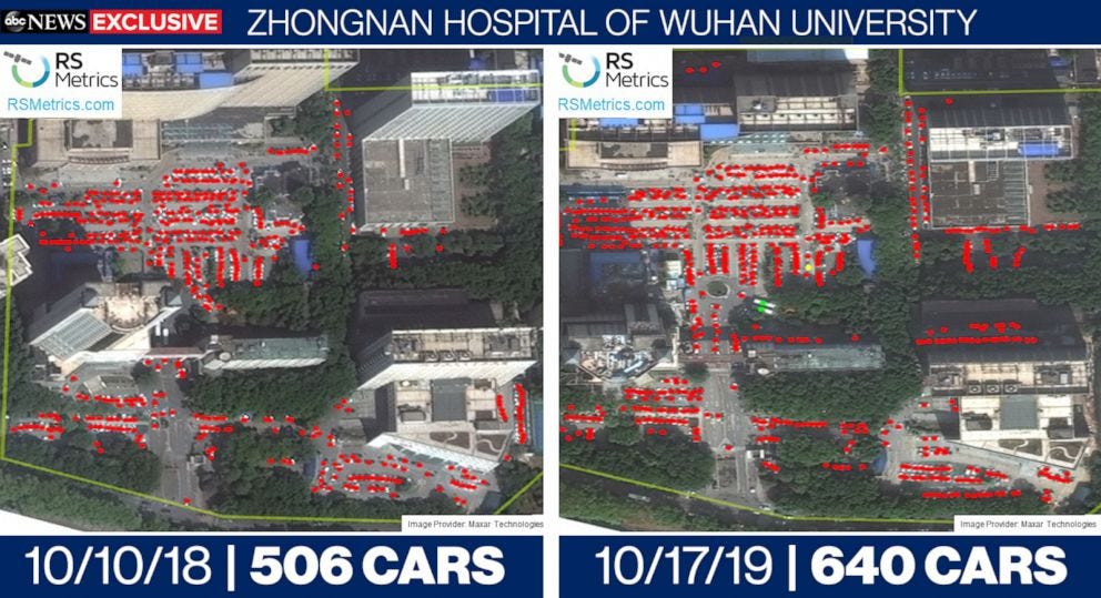
- Analysis of satellite imagery of hospitals from before and during the coronavirus outbreak suggests hospital traffic monitoring could be useful in predicting future outbreaks of infectious disease sooner.
These specific examples harness what is known as optical satellite data, but there is another widely used type called Synthetic Aperture Radar, or SAR, satellite data, which is the kind Capella Space specializes in and what we will be exploring.
Capella Satellites and SAR Data
Capella Space’s mission is to make timely, reliable and persistent Earth observation data the norm using SAR satellites. Capella’s technology can deliver sub-0.5 meter very high resolution geospatial imagery and data. The fine granularity — both spatially and temporally — of Capella’s geospatial data makes it possible to detect tiny, near real-time changes on the Earth’s surface. From analyzing traffic patterns to predicting wildfire occurrences, potential applications of such data span across countless industries.
But what exactly is so special about SAR satellites — how do they compare to optical satellites, the other most widely deployed type?
Optical sensors measure solar light reflected from the Earth’s surface in the visible spectrum to produce images similar to what the human eye sees, making them easily interpretable. However, this also means that optical images are limited by darkness and clouds or strong weather patterns. These factors make optical imagery less than desirable for use in short-term change detection, for which high-fidelity images need to be captured at regular time intervals.
Radar sensors, on the other hand, work by emitting microwaves from an antenna towards a surface and recording the intensity and delay of reflected waves, making them sensitive to slight positional differences. The lengths of these waves are much longer than those of visible or infrared light, making the sensors functional in all lighting conditions and able to penetrate through clouds and dust.
The longer the radar sensor’s antenna (a.k.a. its aperture), the more reflected waves it can collect, leading to a higher resolution image. Synthetic Aperture Radar (SAR) satellites capture high resolution images by mimicking the effects of having longer apertures than they actually do. To illustrate, take a look at the following diagram of SAR operating from a plane:
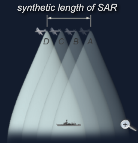
As the plane moves at velocity v from point A to D over a time t, the SAR’s antenna emits continuous pulses. For the sake of simplicity, let’s say it only emits four pulses, one at each point; thus, any one point on the ship will reflect four frequencies, which are Doppler-shifted when received by the SAR antenna. By comparing these four shifted frequencies to a reference frequency, they can be traced back to the single point they reflected off of. In this way, the antenna is able to reconstruct the signal it would have obtained from a much longer antenna of length vT, resulting in a higher resolution image.
Capella has maximized the smaller size benefit of SAR satellites to create their “micro-satellites,” which have “a payload bus the size of a backpack” and thus are much cheaper to manufacture and deploy than traditional satellites. Luckily, Capella makes the data generated by these nimble satellites freely accessible via its API. To request access to it, fill out the form found here.
Interacting with Capella’s SAR satellite data
Now, we will get into the coding portion of this post. Capella has provided some examples of how to fetch and render their satellite data via their public repository of Jupyter Notebooks. I’ll be walking through their examples for generating a time series gif and a change heat map. Starting off, you may find you need to install some of the packages used in the Notebooks. Additionally, to be able to fetch the data with Capella’s API, you’ll need to have your login credentials saved to a “credentials.json” file formatted exactly like:
{
  "username": "my_email@example.com",
  "password": "my_password"
}
Making a time series gif
First, let’s make the gif. The code is found in the “Capella-Time-Series-GIF-Example” in the GitHub repo. Make sure it’s downloaded to the same directory as the credentials.json file you made. Once you’ve done this and installed all the necessary packages, the code should run as is. But let’s walk through it to see how it works.
It starts off with some important parameters for fetching the desired satellite data:
# Data, BBOX, and time definition
bbox = [4.362831, 51.885881 ,4.376993, 51.894436]
timerange = "2019-08-22T00:00:00Z/2019-08-24T23:59:00Z"
collections = ["rotterdam-aerial-mosaic"]# Windows sizes for filtering
FILTSIZE = 3 # window size for speckle filter
Once you have your API credentials, I suggest going to the Capella Console — Capella’s web-based portal for interacting with their existing archival images — to see what data is currently available. Capella has conducted and published aerial collection campaigns of The San Francisco Bay area and Rotterdam, the Netherlands and will soon publish data from their most recent aerial collect in the San Diego area. This is where the collections variable is relevant — it specifies the region you want to receive data from. In the notebook, collections is set to “rotterdam-aerial-mosaic,” so this means we’ll be fetching images of Rotterdam. You can check out what other collections are available through the Console.

timerange, as expected, specifies the window of time you want data from. Check the Console to make sure that there is in fact data available in the collection you chose within the timerange you specify; you can verify this by checking the “Start” parameter of the images in the collection. Additionally, bbox specifies the latitude and longitude coordinates of the bottom left and top right corners of the area that is rendered in the gif (formatted as [lon_lower_left, lat_lower_left, lon_upper_right, lat_upper_right]). You can change these around to render different areas, just make sure they fall within the area of the collection you choose.
A little farther down, we come across the concept of “speckle filtering”:
def lee_filter(img, size):
    img_mean = uniform_filter(img, (size, size))
    img_sqr_mean = uniform_filter(img**2, (size, size))
    img_variance = img_sqr_mean - img_mean**2    overall_variance = variance(img)    img_weights = img_variance / (img_variance + overall_variance)
    img_output = img_mean + img_weights * (img - img_mean)
    return img_output
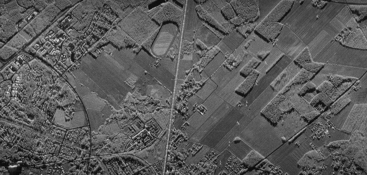
SAR images are inherently grainy due to the interference of scattered waveforms — this interference may be constructive (resulting in a bright spot) or destructive (resulting in a dark spot) dependent upon the relative phases of the waveforms. To get a clearer image, a filtering function is applied — in this case, the Lee filter, which is particularly good at edge preservation. Below is an example of what one of our SAR images looks like before and after filtering. Removing this random variation will be particularly important when doing change analysis in the next example.

Next, the reproject_bbox function is defined:
def reproject_bbox(bb, epsg):
    transformer = Transformer.from_crs("EPSG:4326", epsg, \
          always_xy=True)
    obb = [0] * 4
    obb[0], obb[1] = transformer.transform(bb[0], bb[1])
    obb[2], obb[3] = transformer.transform(bb[2], bb[3])
    return obb
When we provided the latitude and longitude coordinates of the bounding box for the images, we gave them values according to the ESPG 4326 — the Earth’s standard coordinate reference system (CRS). But when capturing the images, the satellite was in its own CRS. This function basically maps the coordinates of our bounding box to the CRS that the satellite was in, which is an essential step in making sure our images look the way we expect them to (I quickly found there is lots of math involved in transforming the SAR data into an interpretable image, but luckily, the author of notebook knew the right packages to use to finish the job).
Our login credentials and the variables we specified above are used to fetch the relevant image data from Capella’s catalog, and we ensure that they are sorted by time so that our time-series gif is meaningful.
Finally, the images are processed one-by-one and added to the gif. We can see that the projection transformation is applied by calling reproject_bbox(). In the following lines, the speckle filtering is applied to reduce random noise, the exposure is adjusted, and the colors are scaled so that we achieve a nice contrast in our final images:
img1 = lee_filter(img1, FILTSIZE)
img1 = exposure.adjust_log(img1, gain=10)

img1_min = img1.min()
img1_max = img1.max()
img1_scaled = (img1 - img1_min) / (img1_max - img1_min) * 255
With this, we achieve our final result:
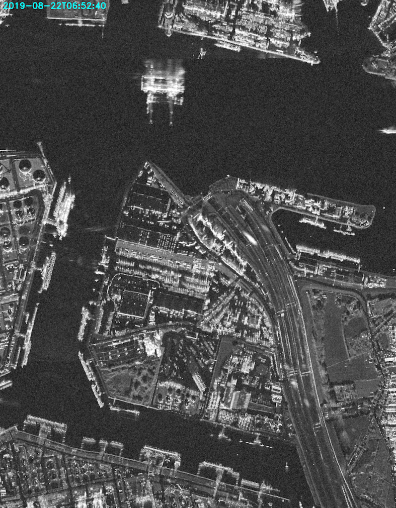
Capella had 11 images within the specified two day time period of 8/22/19 to 8/24/19, and we can see from the timestamps that the time intervals are not evenly spaced. We can see all the changes taking place in this busy port area, including the movement of the individual ships in the waterway. SAR technology makes it possible to visualize such small-scale changes.
Now that we’re familiar with the process of simply acquiring and rendering SAR satellite data, it’d be interesting to do some analysis on it. Capella’s repo has a Notebook to walk us through that process as well.
Change heat map
The code for this example can be found in Capella’s GitHub repo in the Notebook titled “Capella-Log-Ratio-Change-Detection-Example-Using-API-and-COGs.” The initial steps of specifying our time range, collection and bounding box and fetching the data are exactly the same as with making the gif.
When it comes to making the heat map, the overall change in the images over time is found by recording the change between pairs of adjacent images in matrices and then adding them together to build one cumulative change matrix. To accomplish this, adjacent images in the time series of images are looped through in pairs, speckle filtering is applied to both, and then the log-ratio of the pair is calculated:
# Calculate the log ratio of image pairs
dIx = np.log(lee_filt_img2/lee_filt_img1)
The ratio of the two images is taken as opposed to their difference because noise in SAR images is multiplicative, meaning that the intensity of the noise in a particular region of an image varies with that region’s intensity, so taking the ratio ensures that changes between the images will be detected in the same manner in regions of high and low intensity. Further, the logarithm of the ratio is taken to compress the range of variation of the ratio image such that its values are less extreme and to better balance the distribution of “changed” vs. “unchanged” pixels, which will be determined via comparison to a threshold value next. The following image demonstrates the effect of taking the ratio vs. the log-ratio of two images prior to thresholding, the “Context Image” being the first of the series:
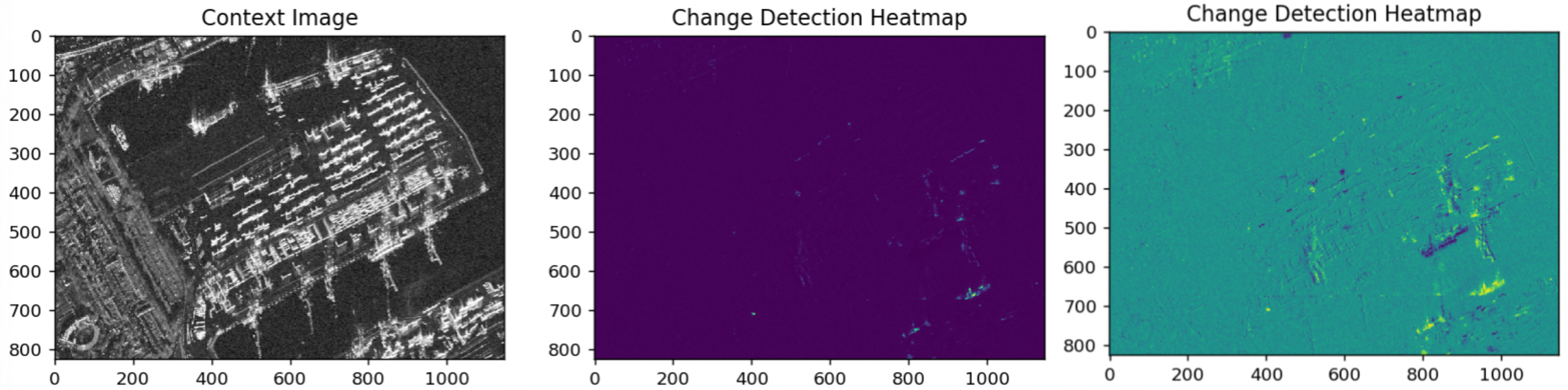
We can see that the pixel values in the log-ratio heat map are less extreme than in the pure ratio and that it picks up on variations that the pure ratio heat map does not — it is more sensitive to change.
Based on this matrix of log-ratios between pixel values, a threshold is calculated, and the ratios are mapped to either 0 or 1 depending on how they compare to it:
thr = np.nanmean(dIx) + THRSET*np.nanstd(dIx)
dIx[dIx < thr] = 0.0
dIx[dIx > thr] = 1.0
The value for the threshold is calculated according to the mean and standard deviation of the values in the log ratio matrix and thus is dependent upon the distribution of pixel values of the two images. It also involves the constant THRSET which can be lowered or increased if you want the map to be more or less sensitive to change, respectively. Additionally, because we will be layering multiple maps on top of each other in the end, mapping each individual one to binary values results in a more coherent representation of change than were we to stack maps with highly variable values within themselves.
Next, the following code uses a SciPy image processing function for “erasing small objects”:
# Morphological opening to reduce false alarms
w = (MORPHWINSIZE, MORPHWINSIZE)
dIx = morphology.grey_opening(dIx, size=w)
In the case of our SAR images, small objects are taken to be points of random noise not eliminated during the speckle filtering, which we don’t want to be recognized as meaningful change.
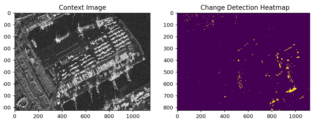
Having gone through all these steps, here is an example of what a change heat map between just two images looks like, with the “Context Image” being the first image of the time series:
As adjacent pairs of images are looped through, their heat maps are stacked on top of each another, resulting in the cumulative change heat map for the 11 images in the two-day series:
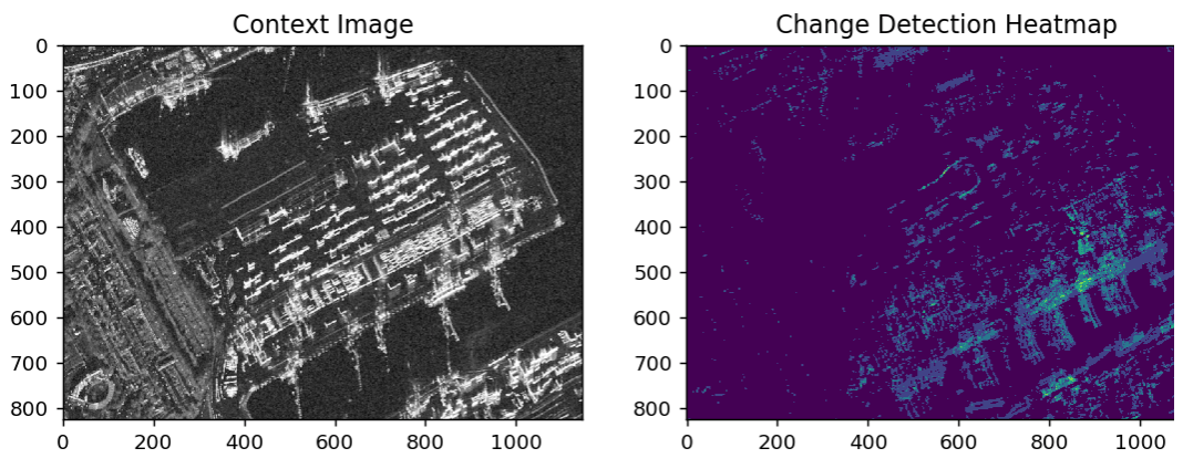
We can see that the most activity over these couple of days took place in the docking area in the bottom right, as we can see the ships that came and went and the moving equipment rendered in lighter shades of blue/green.
Conclusion
Thanks to the simple examples and accessible data Capella has provided, working with satellite data wasn’t as intimidating as I thought it would be. I have also gained a better understanding of the different types of satellite data and their respective use-cases. SAR satellite data isn’t the kind we’re used to seeing, but the simple heat map we have created demonstrates its usefulness in change detection.
Now that I’ve had some experience working with satellite data, in future posts I look forward to exploring more advanced approaches to change detection involving, for example, image segmentation with machine learning.
References
- https://ecologyforthemasses.com/2020/05/27/radar-vs-optical-optimising-satellite-use-in-land-cover-classification/
- https://earthi.space/blog/radar-vs-optical-earth-observation-why-both/
- https://airsar.jpl.nasa.gov/documents/genairsar/radar.html
- https://www.defence24.com/optics-or-radars-what-is-better-for-the-earth-observation-purposes
- https://www.radartutorial.eu/20.airborne/ab07.en.html
- https://en.wikipedia.org/wiki/Speckle_(interference)
- https://www.cs.uaf.edu/~olawlor/ref/asf/sar_equations_2006_08_17.pdf
- https://ieeexplore.ieee.org/abstract/document/1542367
- https://www.researchgate.net/publication/3203744_An_unsupervised_approach_based_on_the_generalized_Gaussian_model_to_automatic_change_detection_in_multitemporal_SAR_images#pfd